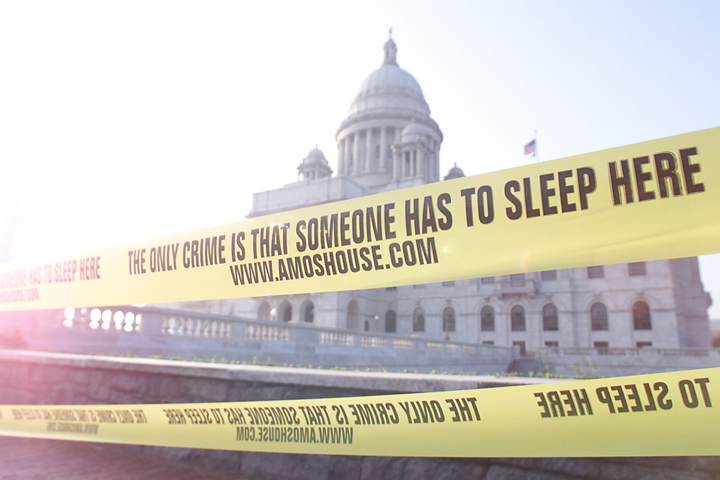
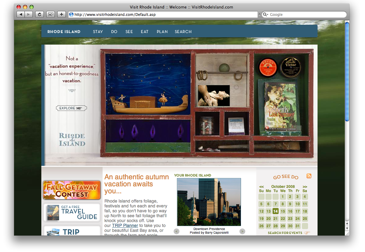
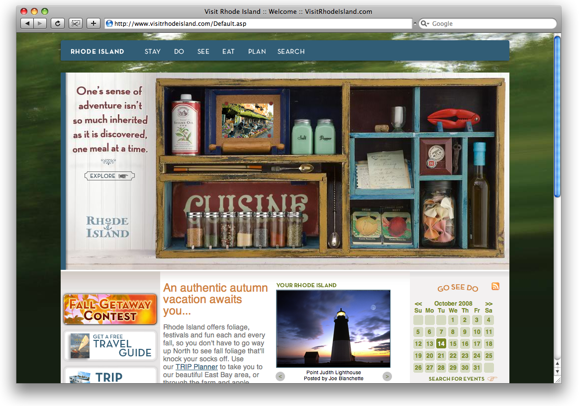
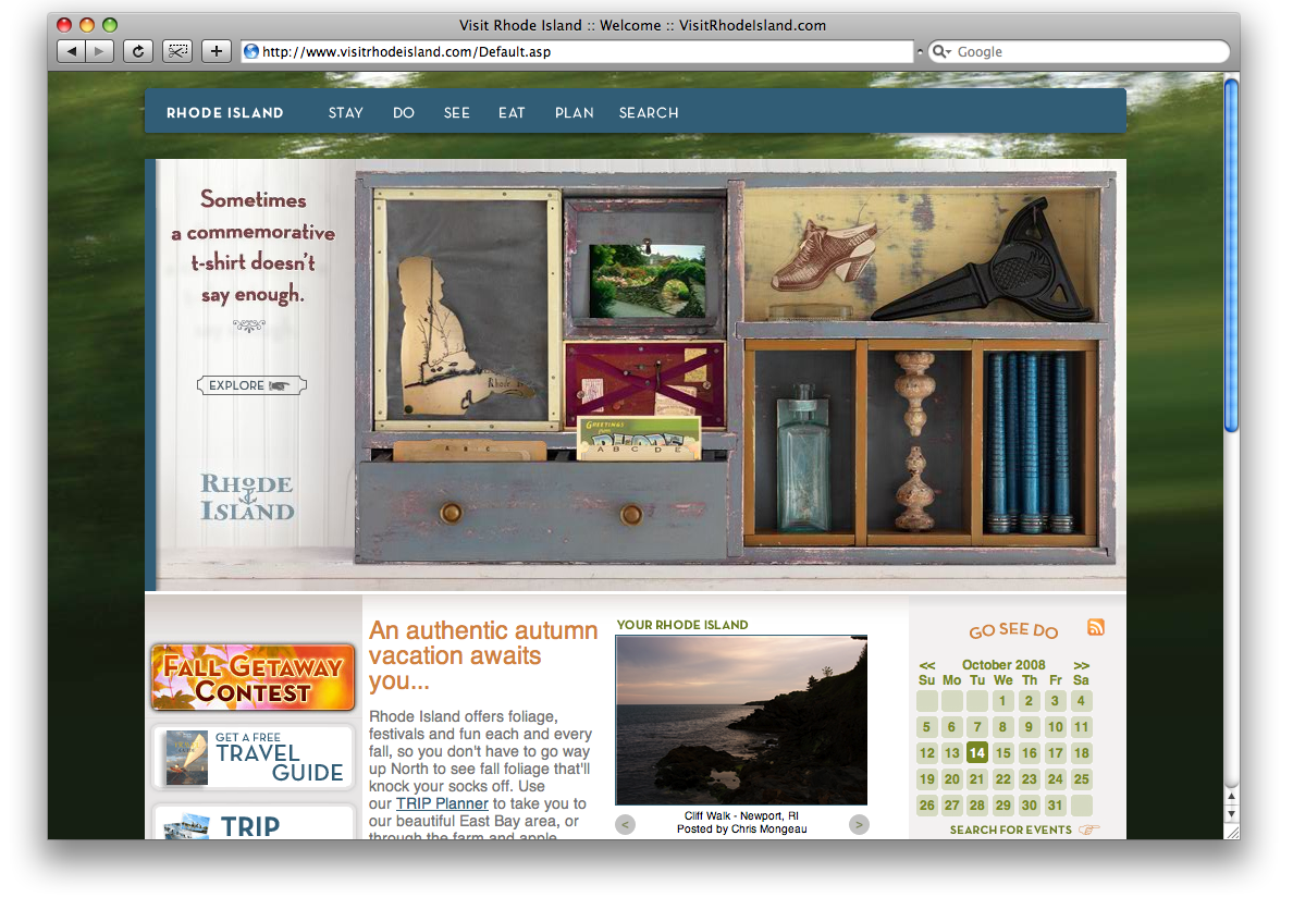
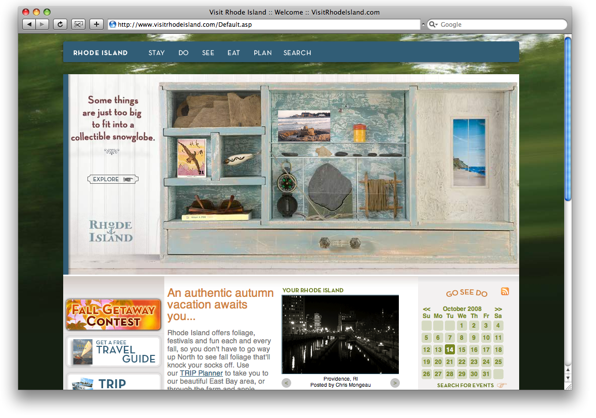
I got to work with the talented Todd Bartel on this RI Tourism project. The Massachusetts-based sculptor created the boxes that served as the theme for these web designs. The boxes were photographed, and the images were sliced and animated to make them interactive. Drawers could be opened, photo albums browsed, ephemera discovered. These four boxes were served up randomly on the Rhode Island Tourism home page.

This was the landing page design for the Outside Magazine launch campaign.
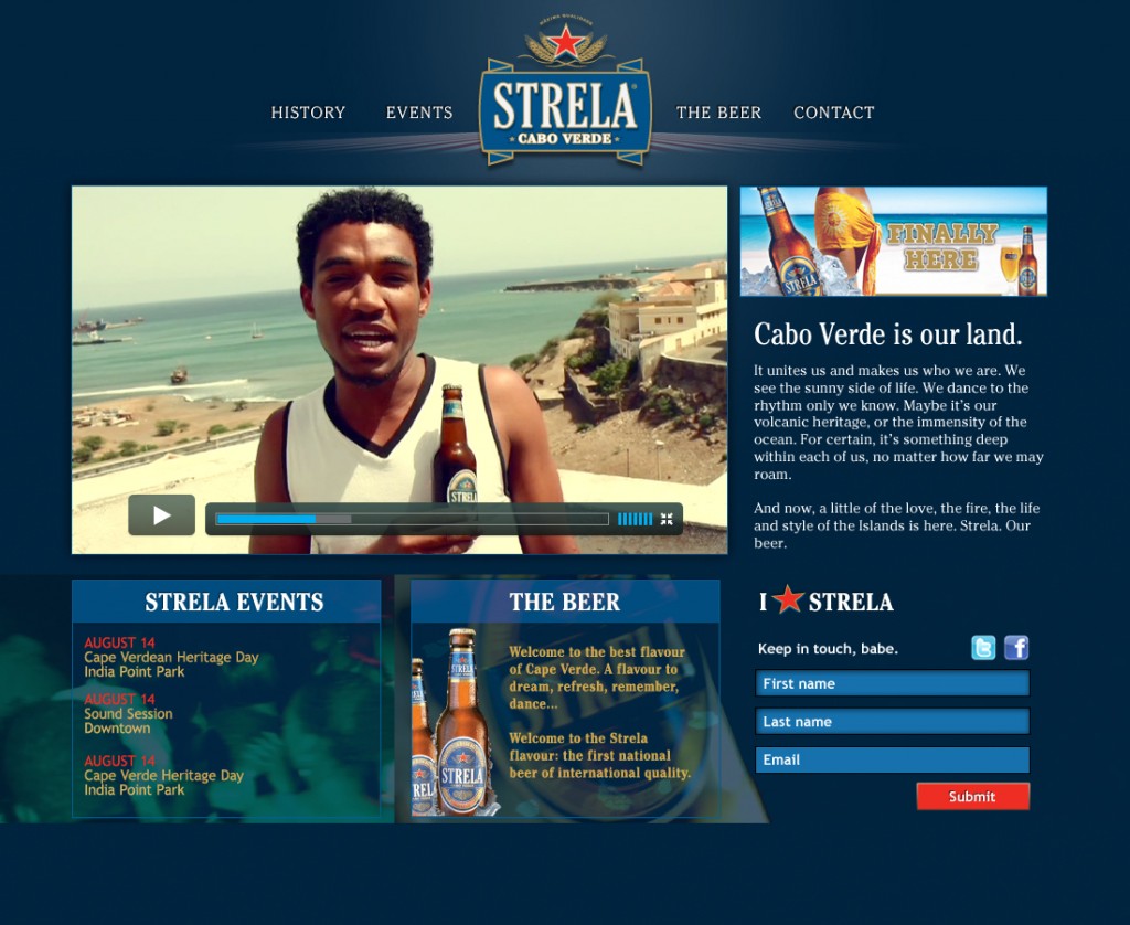
I designed and coded this WordPress site for the US version of Strela beer.

This was a spec design that never ran for Reed & Barton.
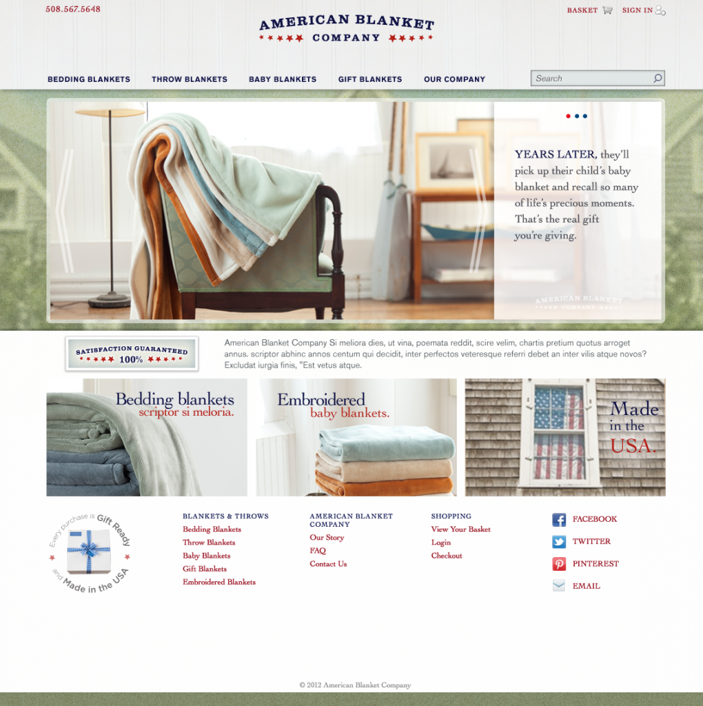
The home page for American Blanket Company. A third party implemented the front and back end of this design.
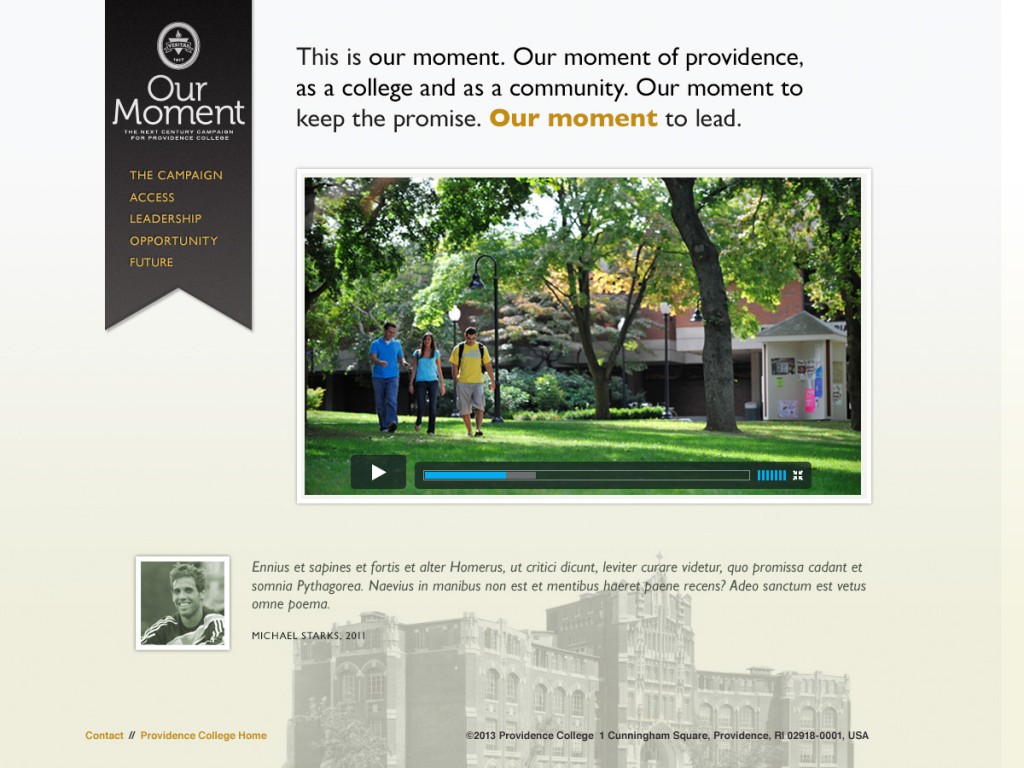
A proposed design for Providence College’s development office.
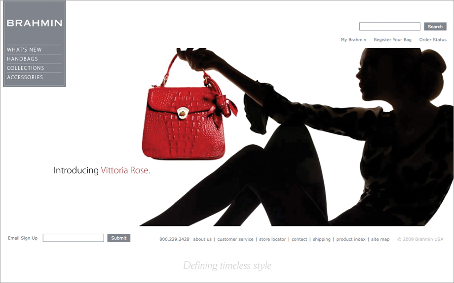
A design for Brahmin. The backend for this project was handled by a third party of the client’s choosing.

The home page for Deepwater Wind’s original web site. There was a limited budget, but the client needed a content management system, so I developed the front end and deployed it on Textpattern, an early cms. This was when WordPress was just starting to emerge as a tool for more than just blogs.
